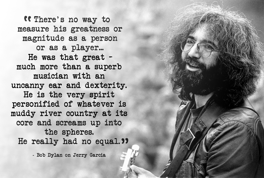
Credit: Dead.net

Credit: Dead.net
This graphic interpretation of a quintessential shark fin and dual bullet tail light of a ’59 Cadillac captures the essence of this classic GM design. The refined lines of the Caddy are juxtaposed with a cozy couple in their Chevy at the Roxy Brown Lantern Drive-In. W.R. (Rocky) Ferris celebrates his early talent and passion in this screen printed image, number 25 or 58, printed in 1978, with applied water color, and white Conte’ crayon.
This idyllic image is titled “59 Vette.” It is a W.R. Ferris screen printed image, number 28 of 70, with applied water color, and white Conte’ crayon. It depicts a scene common to many households, particularly during those “lazy, hazy, crazy days of summer.” We washed and waxed the car by hand, of course, collectors still eschew any other methods. My fourth grade teacher had a ’59 Corvette just like this, a gift from her father upon her graduation from college. The details of the checkered flag are even noted in this nostalgic, photorealistic homage to the past and the car of your dreams.
This image is titled “1954 Corvette.” It is a screen printed image, number 2 of 97, with applied water color, and white Conte’ crayon. It depicts a view from the buyer’s perspective of the steering wheel, dashboard, and surrounding cars on a car lot. The artist attends with passion, graphically, to the infinite details of the industrial design including the speedometer, the tachometer, oil pressure gauge, … A ‘ vette enthusiast will feel like they are in the driver’s seat.
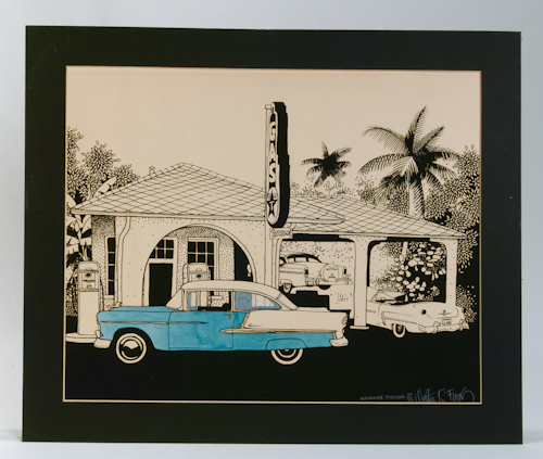
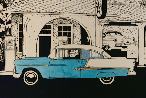
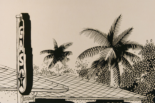
Back in the day, fuel stations dispensed not only gasoline but service “with a smile.” Gasoline, including Texaco, at this service station was pumped, oil levels were checked, windshields were wiped, self-service was not even a concept in consideration. The artist who at the time spent winters in Marathon, Florida, illustrated this open bay garage located in Kissimmee. The perfect backdrop for a period film shoot. The details in both the classic vintage cars, as well as the scenic landscape are fine examples of photorealistic style. The image is not dated formally, however, if one looks closely, the artist uses the date of completion in the license plate: 31678. It is a W.R. (Rocky) Ferris screen printed image, from 1978, number 27 of 53, with applied water color, and white Conte’ crayon.
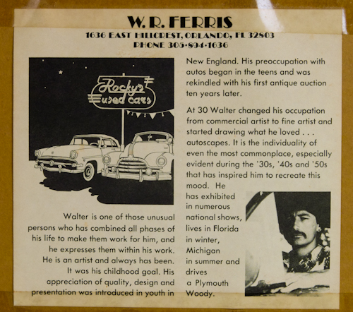
This and three other hand tinted prints by Walter Rockford Ferris, aka Rocky Ferris, were purchased in the summer of 1978 at the Ann Arbor, Michigan Arts Festival. They have been displayed in one residence or another in the family since that time. We disassembled this and the other pieces to clean, photograph, and replace the acid free backer, prior to listing in its original metal, period 70s frame.
“Walter is one of those unusual person who has combined all phases of his life to make them work for him and he expresses them within his work. He is an artist and always has been.
It was his childhood goal. His appreciation for quality, design, and presentation was introduced in his youth in New England. His preoccupation with autos began in his teens and was rekindled with his first antique auction ten years later. At 30, Walter changed his occupation from commercial artists to fine artist and started drawing what he loved… autoscapes.
It is the individuality of the most commonplace, especially during the 30s, 40s, 50s, that has inspired him to recreate this mood. He has exhibited in numerous national shows, lives in Florida in winter, Michigan in summer, and drives a Plymouth Woody.”
His work is in private, corporate, and public collections. He has received numerous commissions, and prestigious awards at art festivals.
His individual style has evolved over the years he describes as “many lives.” Living on a boat and creating miniatures for years, then back on land with a studio, he describes his work as “Tropical Surrealism.” He no longer paints simply photorealistic images, he makes “the normal seem abnormal and abnormal seem normal… surrealism.” A member and an instructor at the Key West Art Center, Key West, Florida, as of 2006. Discovered through numerous sites and links, he may be quoted as stating that “photorealistic images of which are not real or present and come from my mind are what make me feel truly creative.”
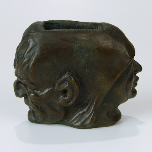
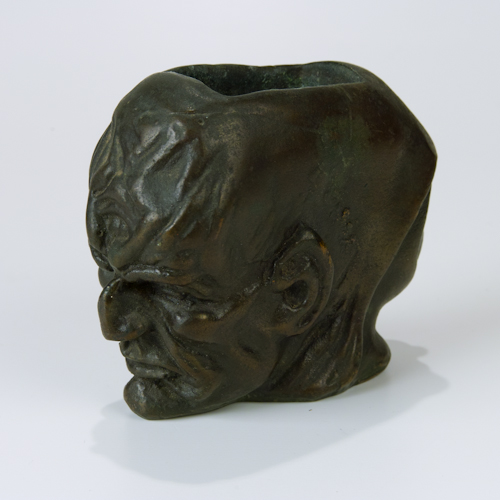
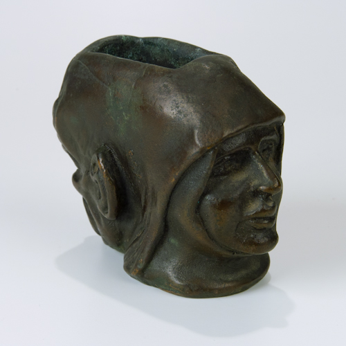
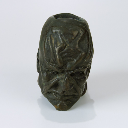
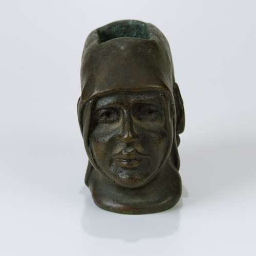
This study in contrast of good and evil, heaven and hell- duality, features the face of a nun in habit as well as the face of a devil. It is a nice bronze piece probably produced as a match holder. It was used as a desk accessory to hold paper clips since the time we purchased it at a store that sold pricey collectible art and antiques in Cincinnati in the 80s. It has a beautiful patina wrought from age.
This provocative, and stunning bronze cast may be associated with the story of Sister Magdalena of the Cross, a renowned Franciscan nun born in Cordoba, Spain in 1487, and died in 1560. Stories depict her as a false mystic, “the devils’s saint for 40 years”, with scathing tests of faith, and her repentance made to “escape the evil pact.” More can be discovered concerning this fascinating story through this link, among others, http://www.mysticsofthechurch.com/2011/12/sister-magdalena-of-cross-nun-who-made.html.
Measurements 4″ wide x 3″ tall x 1 1/2″ deep
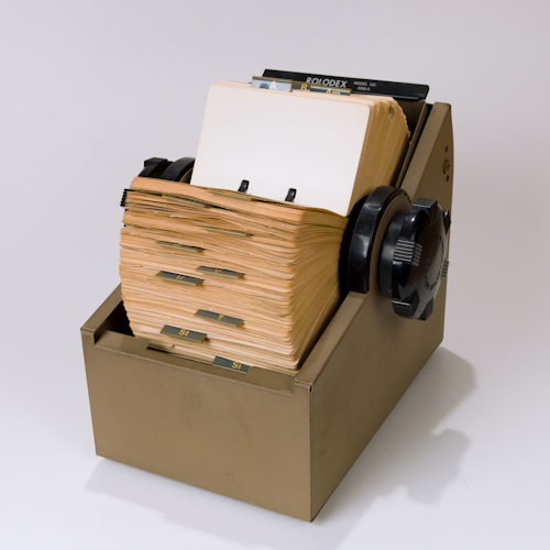
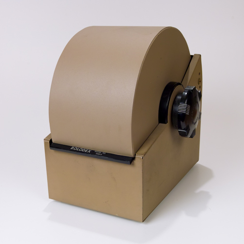
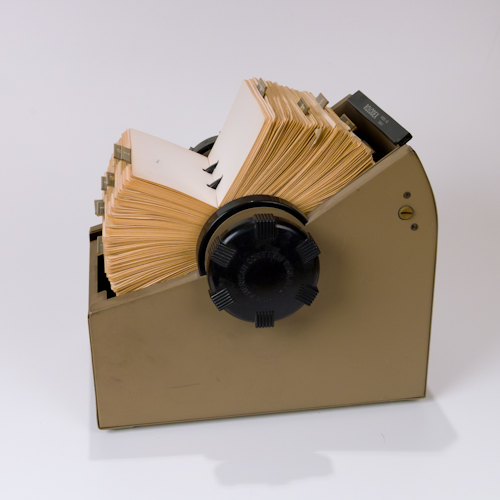
Industrial strength, they just don’t make things like this today! Made in that wonderful industrial greige (that’s grey and beige), this Rolodex is special! Even the top that closes is all metal, not like the newer ones that are plastic. The condition is very good to excellent, no dings, or dents.
As you can see, the plate that indicates it’s a Rolodex 3500 S is present.The handle wheels on either side read Zephyr American Corp., New York, N.Y. Even the bottom still has all four protective pads. I removed the used cards, but left the retro blue alphabetical dividers A-Z, and some blank cards. You would just need to add your contacts if you are using as more than an iconic prop or desk accessory.
Measurements: 10″ tall x 10″ d x 9″ w
Self Taught, Outsider, and Folk Art” by Betty-Carol Sellen describes James Harold Jennings as having been raised and “lived with his mother, a school teacher, until she died in 1974.” Jennings works ranged from bird houses, ferris wheels, angels; all colorful constructions. He used graphic symbols some target like, resembling pointillism, often included verbiage which added luminous humor to the assemblages. His “Tufgh” women beating up on men were frequent subjects for his apparently bawdy sense of humor.
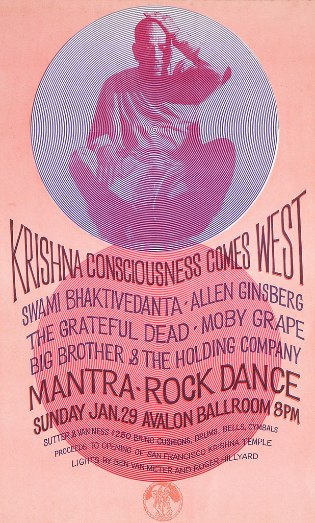
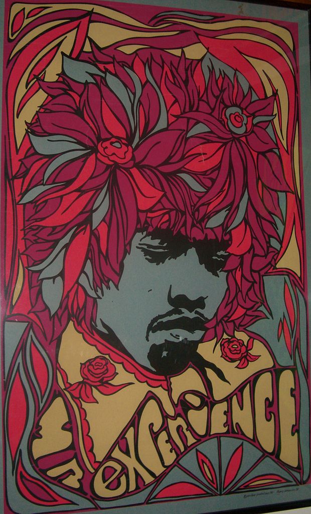
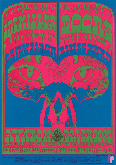
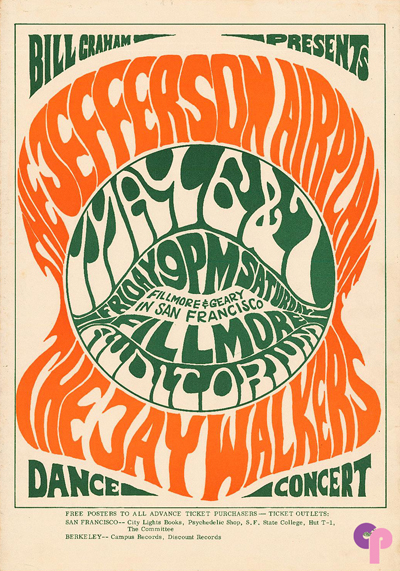
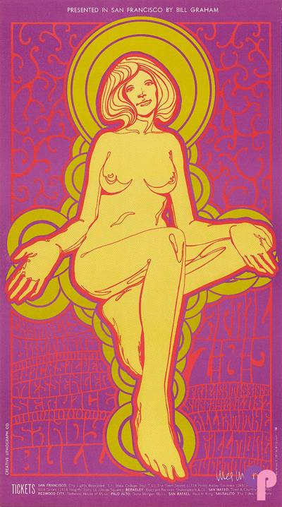
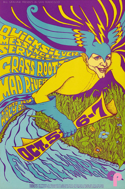
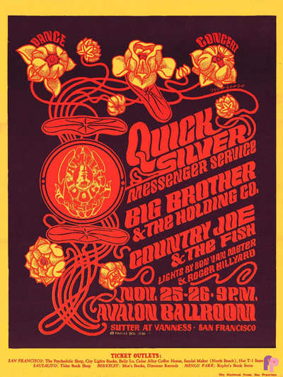
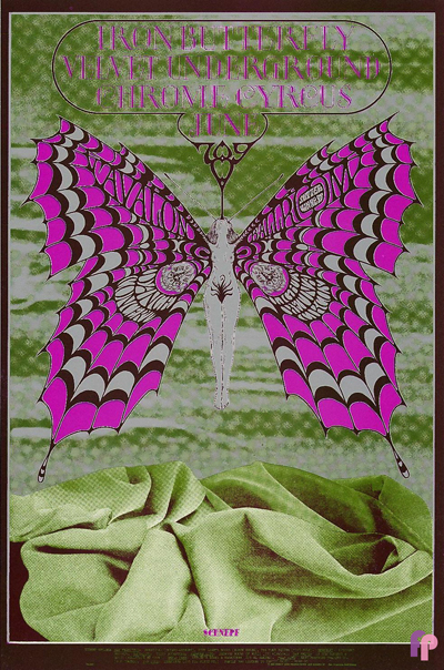
We have had interest and several serious inquiries regarding our hard bound manual of typefaces: Alphabet Thesaurus Vol. 3, published in 1971. As collectors, and designers, we have long held a fascination with type. We received a note from a graphic designer and typographer, Alex Sheldon, whose foundry is called Match and Kerosene. As a freelancer, he has “had the pleasure to work with the likes of Fearless Records, Warner Brothers Records, Motown/Universal, Epitaph Records, and Tooth and Nail/EMI.” His fonts are available through My Fonts. As fellow type and hand lettering fanatics, we thought we would acknowledge him and share some of the original inspirations for our interest.
Our initial interest in hand lettering and fonts was kindled in youth, by the lettering and graphics designed for use in print media in the 60s and 70s. Posters, handbills, album covers, dust jackets, still memorable examples of posters for legendary bands including Cream, Blue Cheer, Traffic, Quick Silver Messenger Service, Moby Grape, the Grateful Dead, Jefferson Airplane, Janis Joplin, Big Brother and the Holding Company, the Doors, the Velvet Underground, and countless others.
Posters by unknown and marginally known artists, such as Wes Wilson, Bob Fried, Gary Grimshaw, Lee Conklin, Bob Schnepf, Bonnie MacLean, as well as the giants, Stanley Mouse and Alton Kelley designing under the moniker, “Family Dog” or Victor Moscoso’s “Neon Rose.” The posters and handbills they created for shows at landmark venues for promoters such as Bill Graham Productions, including the Fillmore Auditorium and the Avalon Ballroom, are highly collectible ephemera today. Boasted as “the world’s largest dealer” in rock and roll posters from that era is ClassicPosters.com. Other resources include Psychotron Posters and Wolfgang’s Vault. The original hand drawn graphics of this era are inspirational. The vibrating and psychedelic effects of some are visually boggling, even to those adept at the latest design apps available through Adobe.
Just the beginning of lost creative innocence, because our interest evolved further with jazz artists and the covers for their vinyl recordings. But beyond even those seminal interests associated with advertising art, however subliminally, we as artists, have sought out and used fonts in our creative endeavors. Paying homage to the creators of well known and well used fonts, as well as more obscure and headline fonts in our work as artists, in print, and through use in our neon and dimensional signage and sculpture. All are bits and pieces of a curious creative continuum.
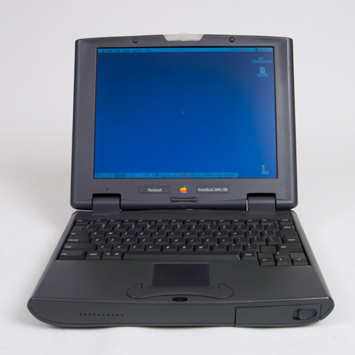
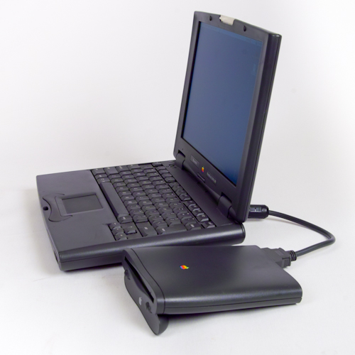
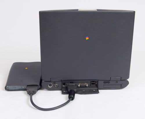
When I think of the word vintage, I think wine, audio equipment, cars, clothing, films. Vintage to some antiquarians also conjures negative connotations – obsolete, or outdated. But, vintage as an adjective has recently seen a resurgence in popularity and use particularly in communities such as Etsy and Tumbler. Vintage has adapted to its new cachet, its time, again, is now.
VIntage Apple 2400
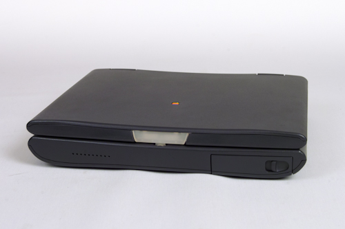
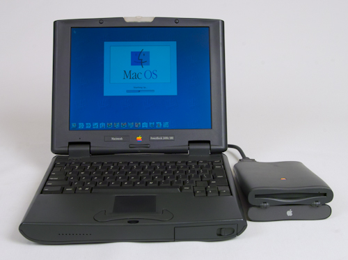
Now that I have your attention, 2400’s are r-a-r-e. Only the PowerBook 550 seems to appear less frequently than the 2400 and, naturally, when they do surface, they tend to demand premium prices. It’s understandable that it is rarely found, let alone, available to collectors, given the nature of this diminutive machine. The 2400 was the precursor to the MacBook Air with its external floppy drive. The PowerBook 2400c was introduced in May 1997. Production was terminated abruptly in May 1998 to be followed by the PowerBook G3.
This Powerbook 2400c is up for auction on ebay.
Vintage Cannondale SR2000, a pristine whip!
This 1988 Cannondale SR2000, 58cm sports a hand built frame and all original, Dura-Ace components. Made when Cannondale was comprised of a few master welders that were fueled by their cycling enthusiasm to build a better bike. And, check out the graphics and paint job! This whip is of museum quality and design.
This 1988 Cannondale SR2000, 58cm sports a hand built frame and all original, Dura-Ace components. Made when Cannondale was comprised of a few master welders that were fueled by their cycling enthusiasm to build a better bike. And, check out the graphics and paint job! This whip is of museum quality and design.
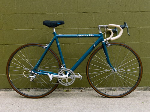
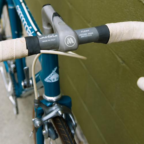
Vintage Cannondale SR800, a classic!
If you haven’t ridden a Cannondale, they are a paradox characteristic of few bikes, sturdy yet nimble. This is a classic 1988 SR800. It has a hand built 53 cm Criterium racing frame with respected original Shimano components. A used car dealer sweeten the pitch, “it has low miles, is all original, and had one owner.”