W.R. Rocky Ferris Autoscape Photorealism Art

Rocky Ferris Roxy Drive in

rocky ferris roxy drive-in 3

rocky Ferris roxy drive-in 2

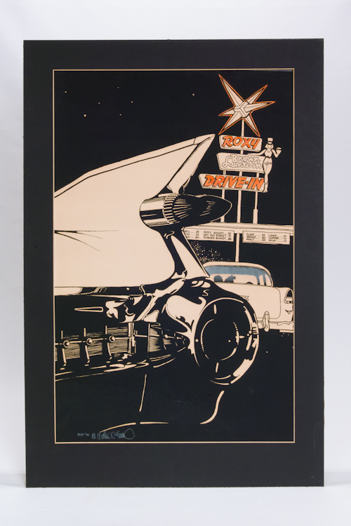
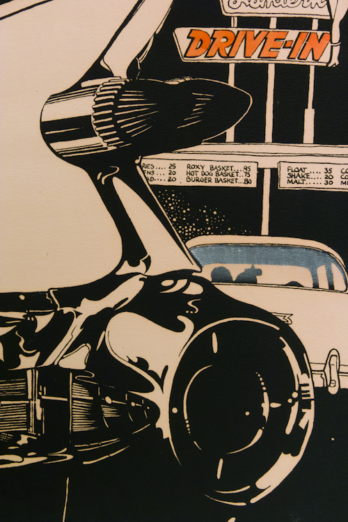
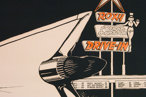
This graphic interpretation of a quintessential shark fin and dual bullet tail light of a ’59 Cadillac captures the essence of this classic GM design. The refined lines of the Caddy are juxtaposed with a cozy couple in their Chevy at the Roxy Brown Lantern Drive-In. W.R. (Rocky) Ferris celebrates his early talent and passion in this screen printed image, number 25 or 58, printed in 1978, with applied water color, and white Conte’ crayon.

rocky ferris 59 corvette 1

rocky ferris 59 corvette 2

rocky ferris 59 corvette

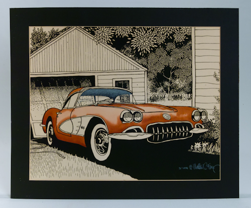
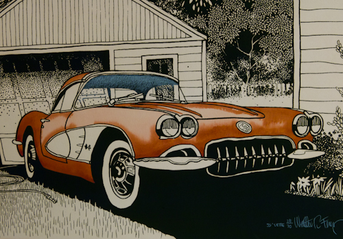
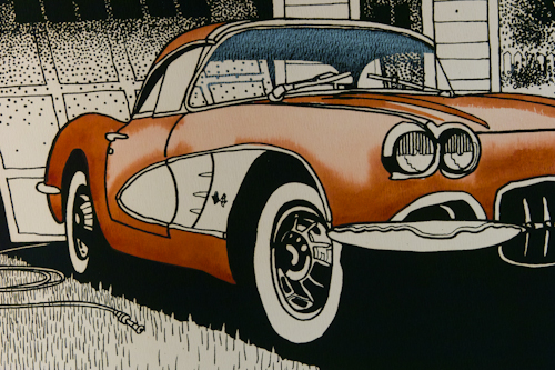
This idyllic image is titled “59 Vette.” It is a W.R. Ferris screen printed image, number 28 of 70, with applied water color, and white Conte’ crayon. It depicts a scene common to many households, particularly during those “lazy, hazy, crazy days of summer.” We washed and waxed the car by hand, of course, collectors still eschew any other methods. My fourth grade teacher had a ’59 Corvette just like this, a gift from her father upon her graduation from college. The details of the checkered flag are even noted in this nostalgic, photorealistic homage to the past and the car of your dreams.

rocky ferris 54 corvette

rocky ferris 54 corvette 2

rocky ferris 54 corvette 2

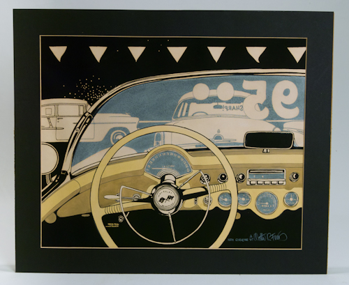
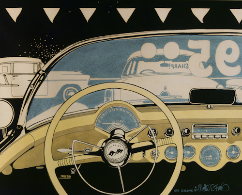
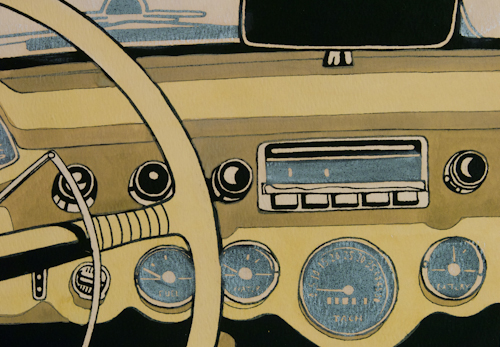
This image is titled “1954 Corvette.” It is a screen printed image, number 2 of 97, with applied water color, and white Conte’ crayon. It depicts a view from the buyer’s perspective of the steering wheel, dashboard, and surrounding cars on a car lot. The artist attends with passion, graphically, to the infinite details of the industrial design including the speedometer, the tachometer, oil pressure gauge, … A ‘ vette enthusiast will feel like they are in the driver’s seat.

rocky ferris kissimmee

rocky ferris kissimmee 1

rocky ferris kissimmee 2

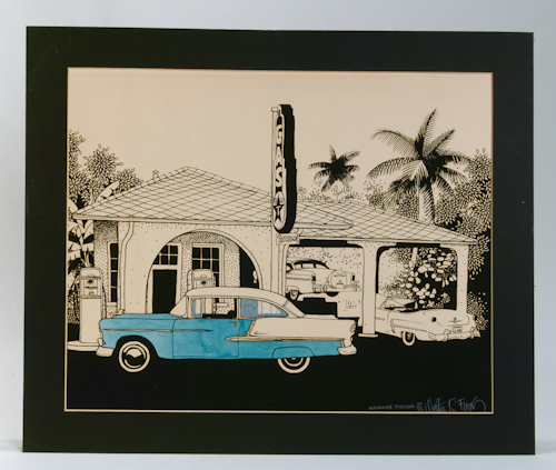
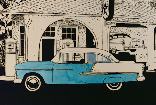
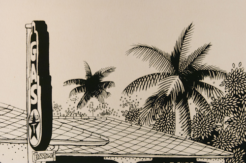
Back in the day, fuel stations dispensed not only gasoline but service “with a smile.” Gasoline, including Texaco, at this service station was pumped, oil levels were checked, windshields were wiped, self-service was not even a concept in consideration. The artist who at the time spent winters in Marathon, Florida, illustrated this open bay garage located in Kissimmee. The perfect backdrop for a period film shoot. The details in both the classic vintage cars, as well as the scenic landscape are fine examples of photorealistic style. The image is not dated formally, however, if one looks closely, the artist uses the date of completion in the license plate: 31678. It is a W.R. (Rocky) Ferris screen printed image, from 1978, number 27 of 53, with applied water color, and white Conte’ crayon.

rocky ferris artist description

This and three other hand tinted prints by Walter Rockford Ferris, aka Rocky Ferris, were purchased in the summer of 1978 at the Ann Arbor, Michigan Arts Festival. They have been displayed in one residence or another in the family since that time. We disassembled this and the other pieces to clean, photograph, and replace the acid free backer, prior to listing in its original metal, period 70s frame.

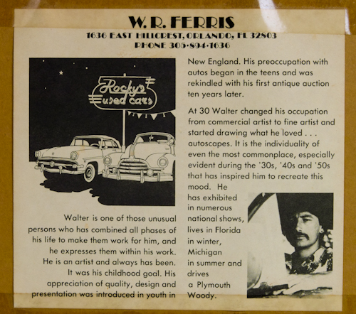
“Walter is one of those unusual person who has combined all phases of his life to make them work for him and he expresses them within his work. He is an artist and always has been.
It was his childhood goal. His appreciation for quality, design, and presentation was introduced in his youth in New England. His preoccupation with autos began in his teens and was rekindled with his first antique auction ten years later. At 30, Walter changed his occupation from commercial artists to fine artist and started drawing what he loved… autoscapes.
It is the individuality of the most commonplace, especially during the 30s, 40s, 50s, that has inspired him to recreate this mood. He has exhibited in numerous national shows, lives in Florida in winter, Michigan in summer, and drives a Plymouth Woody.”

His work is in private, corporate, and public collections. He has received numerous commissions, and prestigious awards at art festivals.

His individual style has evolved over the years he describes as “many lives.” Living on a boat and creating miniatures for years, then back on land with a studio, he describes his work as “Tropical Surrealism.” He no longer paints simply photorealistic images, he makes “the normal seem abnormal and abnormal seem normal… surrealism.” A member and an instructor at the Key West Art Center, Key West, Florida, as of 2006. Discovered through numerous sites and links, he may be quoted as stating that “photorealistic images of which are not real or present and come from my mind are what make me feel truly creative.”

Photo-Lettering, Inc. Alphabet Thesaurus Vol. 3

618px-1967_Mantra-Rock_Dance_Avalon_poster

620px-Mr._Experience

FD-64wmBG5-1wm BG58wm BG87wm

FD-36wm
FD-122wm

Alphabet Thesaurus Vol. 3 Photo-Lettering Inc Cover

Alphabet Thesaurus Vol. 3 Photo-Lettering Inc inside


We have had interest and several serious inquiries regarding our hard bound manual of typefaces: Alphabet Thesaurus Vol. 3, published in 1971. As collectors, and designers, we have long held a fascination with type. We received a note from a graphic designer and typographer, Alex Sheldon, whose foundry is called Match and Kerosene. As a freelancer, he has “had the pleasure to work with the likes of Fearless Records, Warner Brothers Records, Motown/Universal, Epitaph Records, and Tooth and Nail/EMI.” His fonts are available through My Fonts. As fellow type and hand lettering fanatics, we thought we would acknowledge him and share some of the original inspirations for our interest.

Our initial interest in hand lettering and fonts was kindled in youth, by the lettering and graphics designed for use in print media in the 60s and 70s. Posters, handbills, album covers, dust jackets, still memorable examples of posters for legendary bands including Cream, Blue Cheer, Traffic, Quick Silver Messenger Service, Moby Grape, the Grateful Dead, Jefferson Airplane, Janis Joplin, Big Brother and the Holding Company, the Doors, the Velvet Underground, and countless others.

Posters by unknown and marginally known artists, such as Wes Wilson, Bob Fried, Gary Grimshaw, Lee Conklin, Bob Schnepf, Bonnie MacLean, as well as the giants, Stanley Mouse and Alton Kelley designing under the moniker, “Family Dog” or Victor Moscoso’s “Neon Rose.” The posters and handbills they created for shows at landmark venues for promoters such as Bill Graham Productions, including the Fillmore Auditorium and the Avalon Ballroom, are highly collectible ephemera today. Boasted as “the world’s largest dealer” in rock and roll posters from that era is ClassicPosters.com. Other resources include Psychotron Posters and Wolfgang’s Vault. The original hand drawn graphics of this era are inspirational. The vibrating and psychedelic effects of some are visually boggling, even to those adept at the latest design apps available through Adobe.

Just the beginning of lost creative innocence, because our interest evolved further with jazz artists and the covers for their vinyl recordings. But beyond even those seminal interests associated with advertising art, however subliminally, we as artists, have sought out and used fonts in our creative endeavors. Paying homage to the creators of well known and well used fonts, as well as more obscure and headline fonts in our work as artists, in print, and through use in our neon and dimensional signage and sculpture. All are bits and pieces of a curious creative continuum.


Vintage Kentucky Derby Mint Julep Glasses

KyDerby-55-4

1955 Vintage Kentucky Derby Mint Julep Glasses 

Bold bright yellow and green graphics feature two horse racing vigorously, one with #3 on saddle blanket. Five fastest winners names and times are listed.

KyDerby-61-5

1961 Vintage Kentucky Derby Mint Julep Glasses

Black and red Kentucky Derby text is arranged diagonally with a large front view of horse and rider wearing red.  Text is arranged diagonally with winning horses names listed randomly.

KyDerby-58-5

1958 Vintage Kentucky Derby Mint Julep Glass

Mid Century black and gold graphics are well done and present Iron Leige on front of glass as the last winner.  Graphics are slightly different on each side.  Horse with #2 is featured on one side, reverse side has horse with #3.

KyDerby-62-1

1962 Vintage Kentucky Derby Mint Julep Glass

Gold gilt text arranged on frosted glass with winners listed in red text, rider on horse # 6 draped with an oversized rose collar. Steeples, jockey caps and horseshoes are accents.

KyDerby-63-1

1963 Vintage Kentucky Derby Mint Julep Glass

Brown and white with gold leaf text, the rider is wearing #7. In the background, the steeple of the track is visible. Jockey caps are the other decorative elements.

KyDerby-64-1

1963 Vintage Kentucky Derby Mint Julep Glass

The brown and gold distinctive graphics on these glasses feature the head of a horse surrounded by text arranged in an arch. Jockey caps are the other decorative elements.

KyDerby-65-1

1965 Vintage Kentucky Derby Mint Julep Glass

Bold red banners float about the distinctive race track buildings and horse in brown graphics. Glass is completely frosted and highlighted by red Run for the Roses text. Roses are depicted in a large bouquet on back of glass.

KyDerby-66-1

1965 Vintage Kentucky Derby Mint Julep Glass

Two riders on horses numbered 2 and 3 are depicted in a side view within a circle that is surrounded by gold leaf text. Four fastest running years are listed below horses. The famous steeples of Churchill Downs are on the back of glass.

KyDerby-67-4

1967 Vintage Kentucky Derby Mint Julep Glass

Black squares are filled with racing graphics, steeples with pennants flying and other symbols. Frosted white squares have lists of winners. Text is gold ink.

KyDerby-68-1


1968 Vintage Kentucky Derby Mint Julep Glass

The famous steeple banners fly over a red and blue shield with racing graphics. Gold ink is used for the derby text.

KyDerby-70-1

1970 Vintage Kentucky Derby Mint Julep Glass

Green shield shaped graphics have a crossed ribbon detail for gold ink text. Red jockey caps are an accent graphic.

KyDerby-72-5

1972 Vintage Kentucky Derby Mint Julep Glass

Orange and green graphics feature two horses charging toward the finish line. Steeples are in green with orange used for the text.

KyDerby-73-1

1973 Vintage Kentucky Derby Mint Julep Glass

Elegant red, green and black graphics feature a rider and horse draped with rose collar and the famous steeples. Text and other graphics are in green.

KyDerby-74-4


1974 Vintage Kentucky Derby Mint Julep Glass

The official 100th Anniversary glass has a brownish tan frosted finish as the back drop for a horse head surrounded by a gold oval.

These vintage items are pre-owned by one family and were collected when new. Used primarily for display they were recently discovered carefully wrapped in a family storage cabinet.

1960’s Vintage Hamm’s Beer Glasses

Hamm's beer glass


The red text, gold rim and blue used for the slogan “From the Land of Sky Blue Waters” on these small beer glasses are distinctively styled.   A popular advertising product in the 60’s, these glasses were used as a unique and durable promotional item for Hamm’s Beer Company, located on St. Paul, Minnesota.

Size  approximately 3.25 inches tall by 2.375 inches in diameter 


Vintage Swatch Watch 1984 Chrono-Tech Swatch Rare

redSwatch-b-8778
Vintage Swatch Watch 1984 Chrono-Tech

A 1984 Chrono-Tech, rarely found or sold, on Swatch watch collectors must have list! Among the Originals Family of Swatch Watches. It was purchased and worn occasionally. Retro, and highly collectible vintage considered a women’s watch measuring 25 mm in diameter. The Swatch model is LB104 and was produced for the Fall – Winter 1984 Swatch Collection. This is the ladies version of the GB403 Chrono-Tech. Its red band is plastic, it has a black case, with red, blue, and yellow hands. Like all Swatch watches of that era, it is a Swiss quartz, battery operated analog watch which is water resistant to 3 Bar/100′. It has a new battery. It is in very good vintage condition, see photographs.

Measurements: 25.00 mm diameter case, 7.50 mm thick case, 12.00 mm strap width

Crushed Velvet Neon Heart Light

velvet Neon Heart velvetNeonHeart-b--3

Turn on your love light with this neon crushed velvet heart. This sensual prop was originally created as a decorative focal point for the Valentine’s Day dinner seatings and party at a trendy restaurant and lounge. Made of velvet, with a wood base, the red neon surrounds the heart in a halo of seductive light. It is powered by a solid state transformer, with 6′ cord, which plugs into a 120V (house current) grounded receptacle. The entire piece weighs less than 20#, complete with hanger assembly.

Measurements: 42″ tall, 44″ wide, 4.5″ deep

Vintage Yellow Enamel Paint Steel Pendant Light

yellowLamp-b-9181

yellowLamp-b-9184

yellowLamp-b-9188

A cheery yellow pendant light shade fixture. Made of steel with a yellow painted enamel finish on the top side and pristine clean white underside to reflect light. The waved shade is 20″ in diameter, the height is 7″. It is light enough to be supported exclusively by the swagged clean white cord (10′ included) with plug. This listing is for one light, although we have a second pendant available listed separately both in excellent vintage condition.

Measurements: 20″ diameter, 7″ tall

Retro 80s Italian Plastic Office Pencil/Pen Holder and Sharpener

pencil holder
pencil holder
This retro plastic pencil and pen display, marked made in Italy, was purchased in 1985. It assures orderly storage and a built in pencil sharpener! Functional and definitely hip enough to display on a desk in office or counter for convenient use. It shows use but is in good vintage condition.

Measurements: 3″ tall x 3″ wide x 3″ deep