Photo-Lettering, Inc. Alphabet Thesaurus Vol. 3

618px-1967_Mantra-Rock_Dance_Avalon_poster

620px-Mr._Experience

FD-64wmBG5-1wm BG58wm BG87wm

FD-36wm
FD-122wm

Alphabet Thesaurus Vol. 3 Photo-Lettering Inc Cover

Alphabet Thesaurus Vol. 3 Photo-Lettering Inc inside


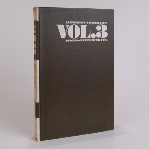
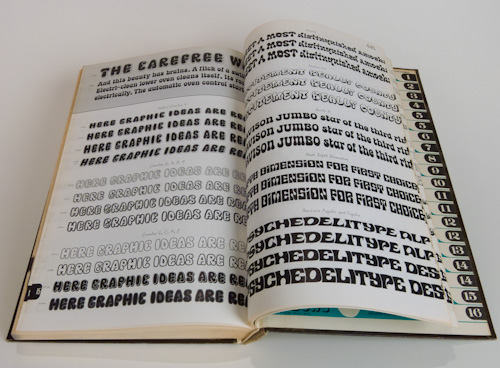
We have had interest and several serious inquiries regarding our hard bound manual of typefaces: Alphabet Thesaurus Vol. 3, published in 1971. As collectors, and designers, we have long held a fascination with type. We received a note from a graphic designer and typographer, Alex Sheldon, whose foundry is called Match and Kerosene. As a freelancer, he has “had the pleasure to work with the likes of Fearless Records, Warner Brothers Records, Motown/Universal, Epitaph Records, and Tooth and Nail/EMI.” His fonts are available through My Fonts. As fellow type and hand lettering fanatics, we thought we would acknowledge him and share some of the original inspirations for our interest.

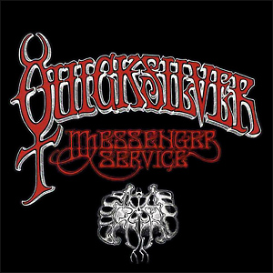
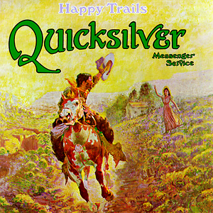
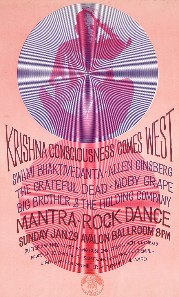
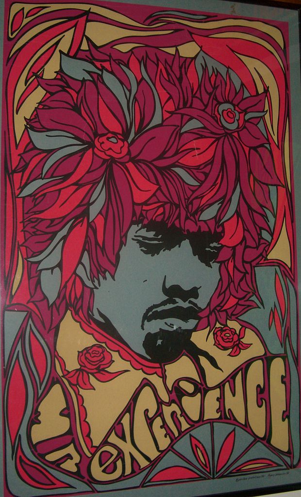
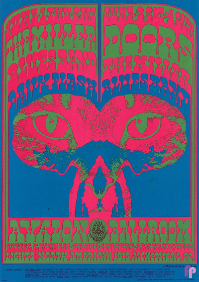
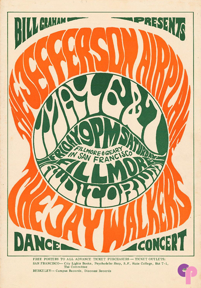
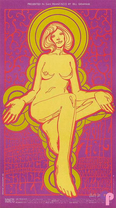
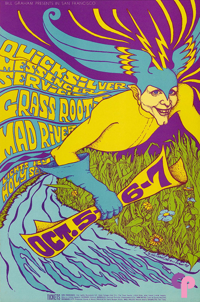
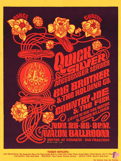
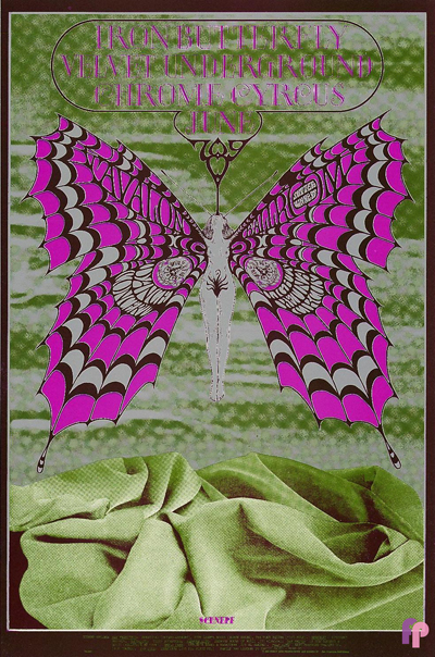
Our initial interest in hand lettering and fonts was kindled in youth, by the lettering and graphics designed for use in print media in the 60s and 70s. Posters, handbills, album covers, dust jackets, still memorable examples of posters for legendary bands including Cream, Blue Cheer, Traffic, Quick Silver Messenger Service, Moby Grape, the Grateful Dead, Jefferson Airplane, Janis Joplin, Big Brother and the Holding Company, the Doors, the Velvet Underground, and countless others.

Posters by unknown and marginally known artists, such as Wes Wilson, Bob Fried, Gary Grimshaw, Lee Conklin, Bob Schnepf, Bonnie MacLean, as well as the giants, Stanley Mouse and Alton Kelley designing under the moniker, “Family Dog” or Victor Moscoso’s “Neon Rose.” The posters and handbills they created for shows at landmark venues for promoters such as Bill Graham Productions, including the Fillmore Auditorium and the Avalon Ballroom, are highly collectible ephemera today. Boasted as “the world’s largest dealer” in rock and roll posters from that era is ClassicPosters.com. Other resources include Psychotron Posters and Wolfgang’s Vault. The original hand drawn graphics of this era are inspirational. The vibrating and psychedelic effects of some are visually boggling, even to those adept at the latest design apps available through Adobe.

Just the beginning of lost creative innocence, because our interest evolved further with jazz artists and the covers for their vinyl recordings. But beyond even those seminal interests associated with advertising art, however subliminally, we as artists, have sought out and used fonts in our creative endeavors. Paying homage to the creators of well known and well used fonts, as well as more obscure and headline fonts in our work as artists, in print, and through use in our neon and dimensional signage and sculpture. All are bits and pieces of a curious creative continuum.


Quicksilver Messenger Service Live at Monterey International Pop Festival 1967

Quicksilver Messenger Service gained wide popularity in the San Francisco “Bay Area” and through their recordings, with psychedelic rock enthusiasts around the globe, and several of their albums ranked in the Top 30 of the Billboard Pop charts. Though not as commercially successful as contemporaries Jefferson Airplane and The Grateful Dead, Quicksilver was integral to the beginnings of their genre. With their jazz and classical influences and a strong folk background, the band attempted to create a sound that was individual and innovative. Member Dino Valenti drew heavily on musical influences he picked up during the folk revival of his formative musical years. The style he developed from these sources is evident in Quicksilver Messenger Service’s swung rhythms and twanging guitar sounds.

Quicksilver_Messenger_Service_(album)

Quicksilver Messenger Service released their eponymous debut album in 1968. It was followed by Happy Trails, released in early 1969 and largely recorded live at the Fillmore East and the Fillmore West. According to David Freiberg, at least one of the live tracks was augmented with studio overdubs and the tracks “Calvary” and “Lady of the Cancer Moon” were recorded in the studio just before Gary Duncan left the band.

Quicksilver_Messenger_Service-Happy_Trails_(album_cover)

These albums, which have been hailed as “…two of the best examples of the San Francisco sound at its purest,” define the classic period in the group’s career and showcase their distinctive sound, emphasizing extended arrangements and fluid twin-guitar improvisation. Cipollina’s highly melodic, individualistic lead guitar style, combined with Gary Duncan’s driving rhythm guitar, feature a clear jazz sound, a notable contrast to the heavily amplified and overdriven sound of contemporaries like Cream and Jimi Hendrix. In 2003 Happy Trails was rated at No. 189 in the Rolling Stone Top 500 albums survey, where it was described as “…the definitive live recording of the mid-Sixties San Francisco psychedelic-ballroom experience…” Archetypal Quicksilver Messenger Service songs include the elongated, continually re-titled suite based on Bo Diddley’s Who Do You Love?, featured on Happy Trails.

Performing at the Monterey International Pop Festival in June 1967

httpv://www.youtube.com/watch?v=bqVVnExlX9c

source: Wikipedia